Grid Fundamentals: Part One
Use Grid to display a collection of products, similar to that of an e-commerce website.
In this tutorial you will use Grid to display a collection of products, similar to that of an e-commerce website, and use its properties to:
- Present a collection of items in a grid.
- Allow the number of grid columns to adapt to a variety of screen widths.
- Allow the items to adapt and flex within the available space.
At the end of this tutorial, you will have built this:
Prerequisites
This tutorial can be completed in its entirety by following the steps below. However, because Grommet is a ReactJS-based UI library, introductory knowledge of React may be helpful in understanding the syntax.
Getting started
Let’s get started. Use this CodeSandbox template as a starter.
First, in App.js add the Grid to your project by importing it from Grommet and
placing it around the “hello world” text.
// App.js
import { Grommet, Box, Heading, Text, ThemeContext, Grid } from 'grommet';
import { hpe } from 'grommet-theme-hpe';
...
return (
  <Grid>
    <Text>hello world</Text>
  </Grid>
);
Let's also add a heading to the page.
<>
  <Heading level={1}>Products</Heading>
  <Grid>
    <Text>hello world</Text>
  </Grid>
</>
Add placeholder content
Now that you have the Grid in place, let's add some placeholder content. Replace the "hello world" text with the following:
<Grid>
  <Box background="blue!" border pad="medium" align="center">
    <Text size="large">Product 1</Text>
  </Box>
  <Box background="blue!" border pad="medium" align="center">
    <Text size="large">Product 2</Text>
  </Box>
  <Box background="blue!" border pad="medium" align="center">
    <Text size="large">Product 3</Text>
  </Box>
  <Box background="blue!" border pad="medium" align="center">
    <Text size="large">Product 4</Text>
  </Box>
  <Box background="blue!" border pad="medium" align="center">
    <Text size="large">Product 5</Text>
  </Box>
  <Box background="blue!" border pad="medium" align="center">
    <Text size="large">Product 6</Text>
  </Box>
  <Box background="blue!" border pad="medium" align="center">
    <Text size="large">Product 7</Text>
  </Box>
</Grid>
We now have a Grid with seven boxes, each containing a product name. The Grid is displaying the boxes in a single column, which is the default behavior.
Add columns
To display the boxes in a grid, we need to add columns. The Grid component has a
columns property that allows you to specify the number and/or width of the
columns you want to display. Let's add the columns property to the Grid and set
it to { count: 3, size: 'auto' }.
<Grid columns={{ count: 3, size: 'auto' }}>...</Grid>
Now the boxes are displayed in a grid with three columns.
Products
Add product content
Now that we have a grid with three columns, let's add some product content to the
boxes. Start by adding ProductCard and productList to App.js. ProductCard is
a template set up for ease of use and will be used to display the product image, name,
and price. productList is a JSON file containing the product data.
// App.js
import { Grommet, Box, Heading, Text, ThemeContext, Grid } from 'grommet';
import { hpe } from 'grommet-theme-hpe';
import { ProductCard } from './ProductCard';
import productList from './product-list.json';
...
Then, replace the placeholder content with the following:
<Grid columns={{ count: 3, size: 'auto' }}>
  {productList.map(product => (
    <ProductCard
      key={product.id}
      name={product.name}
      price={product.price}
      image={product.image}
    />
  ))}
</Grid>
Now the products are displayed in the grid with three columns.
Products
Handmade Wooden Chair
Sit and relax on a seat made from a real tree. Crafted by hand, by a real live person. This chair is made from a tree that was cut down and then carved.
Gorgeous Fluffy Towels
These towels are so fluffy, you'll want to take a nap on them. They're so fluffy, I'm gonna die!
Electronic Lemon Car
It's electronic. It's lemon in color. It's a car. What more do you need to know? It's almost as if two adjectives and a noun were chosen at random to describe this product.
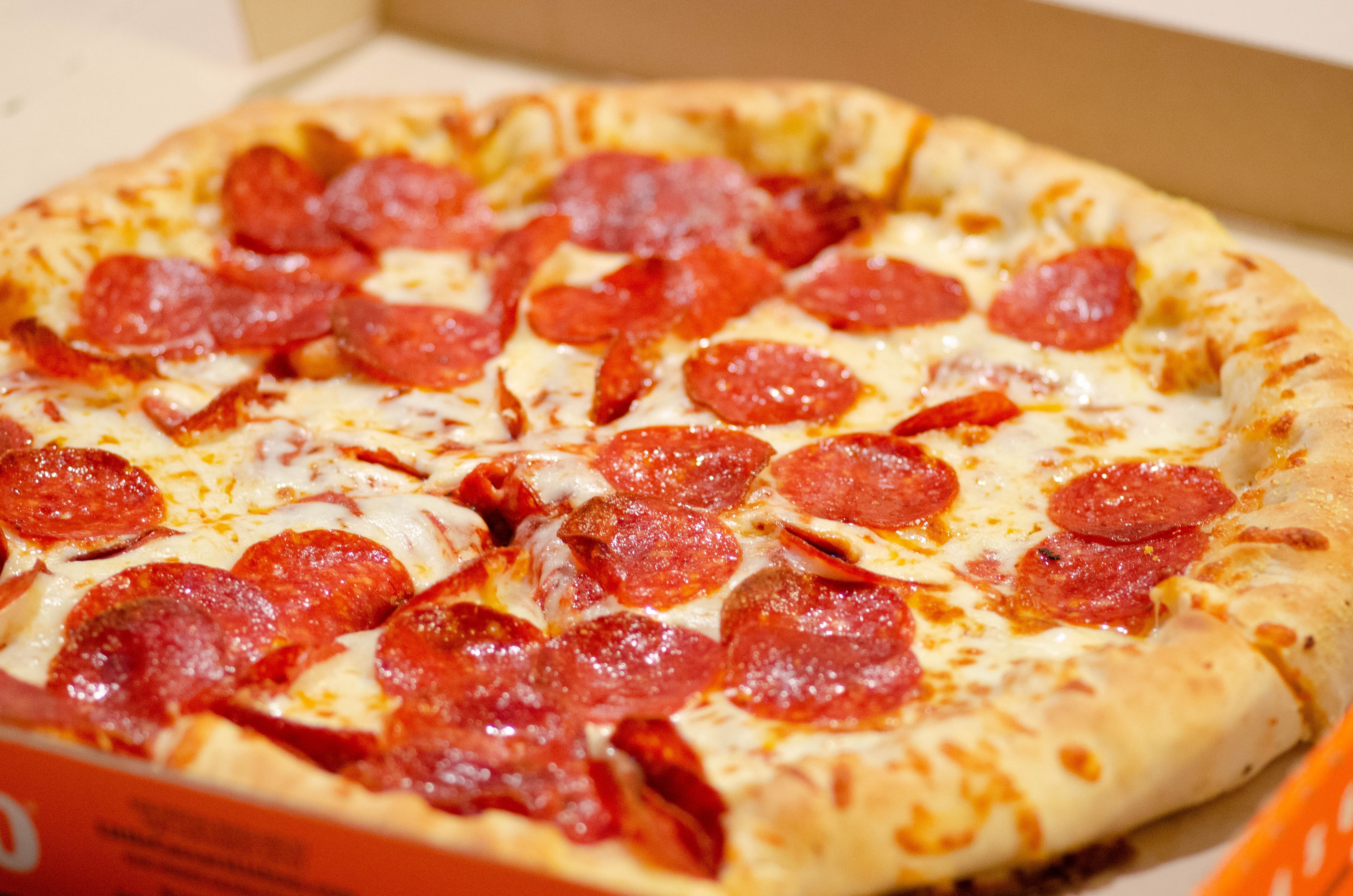
Luxurious Soft Pizza
Luxurious melty cheese. Soft, chewy crust. Freshly baked. Mmmm... pizza.

Handcrafted Feather Hat
This entire hat is made from real feathers. Yankee-Doodle would be jealous.
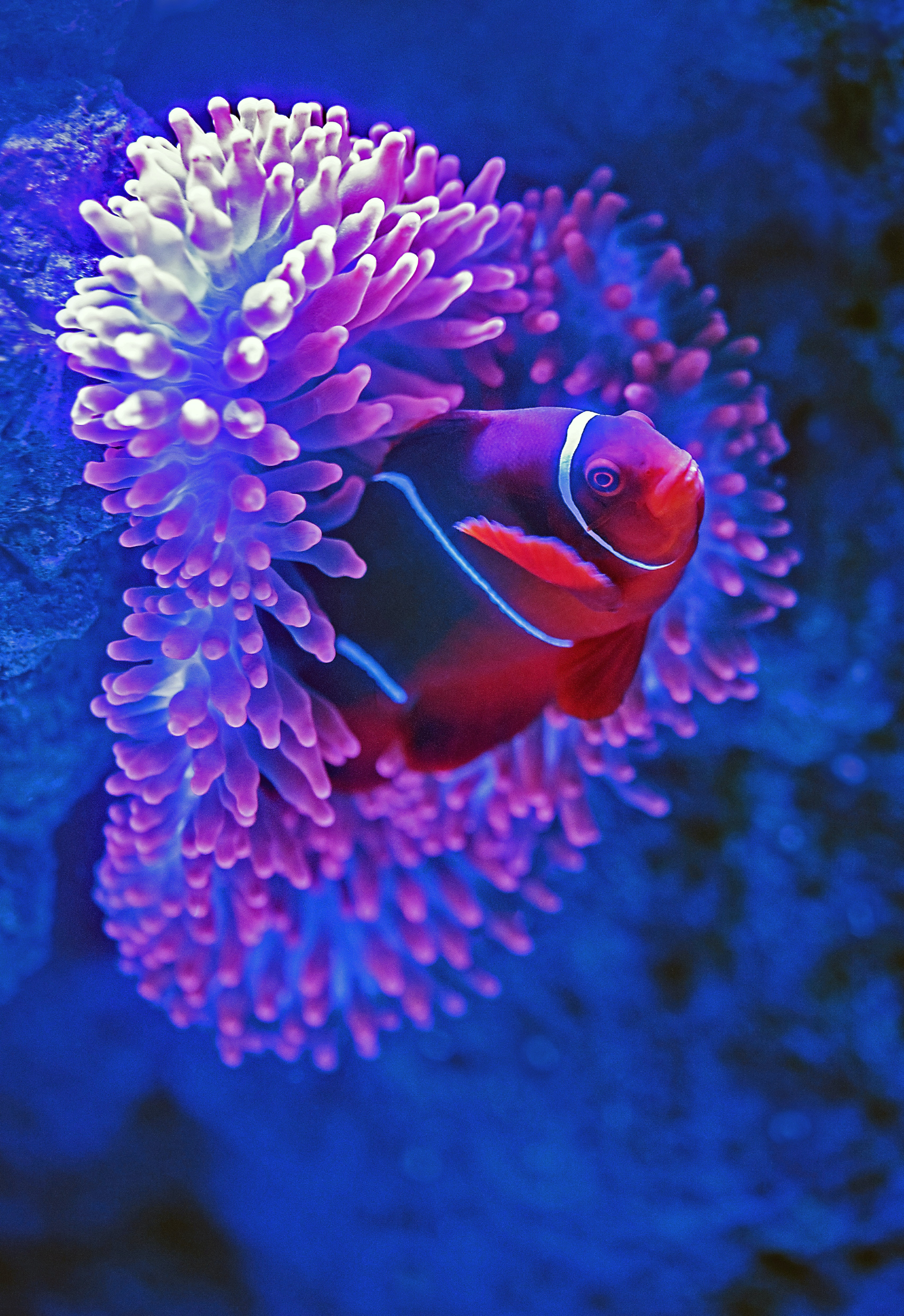
Exotic Rubber Fish
This rubber fish is guaranteed to float and guaranteed to make your aquarium look more exotic.
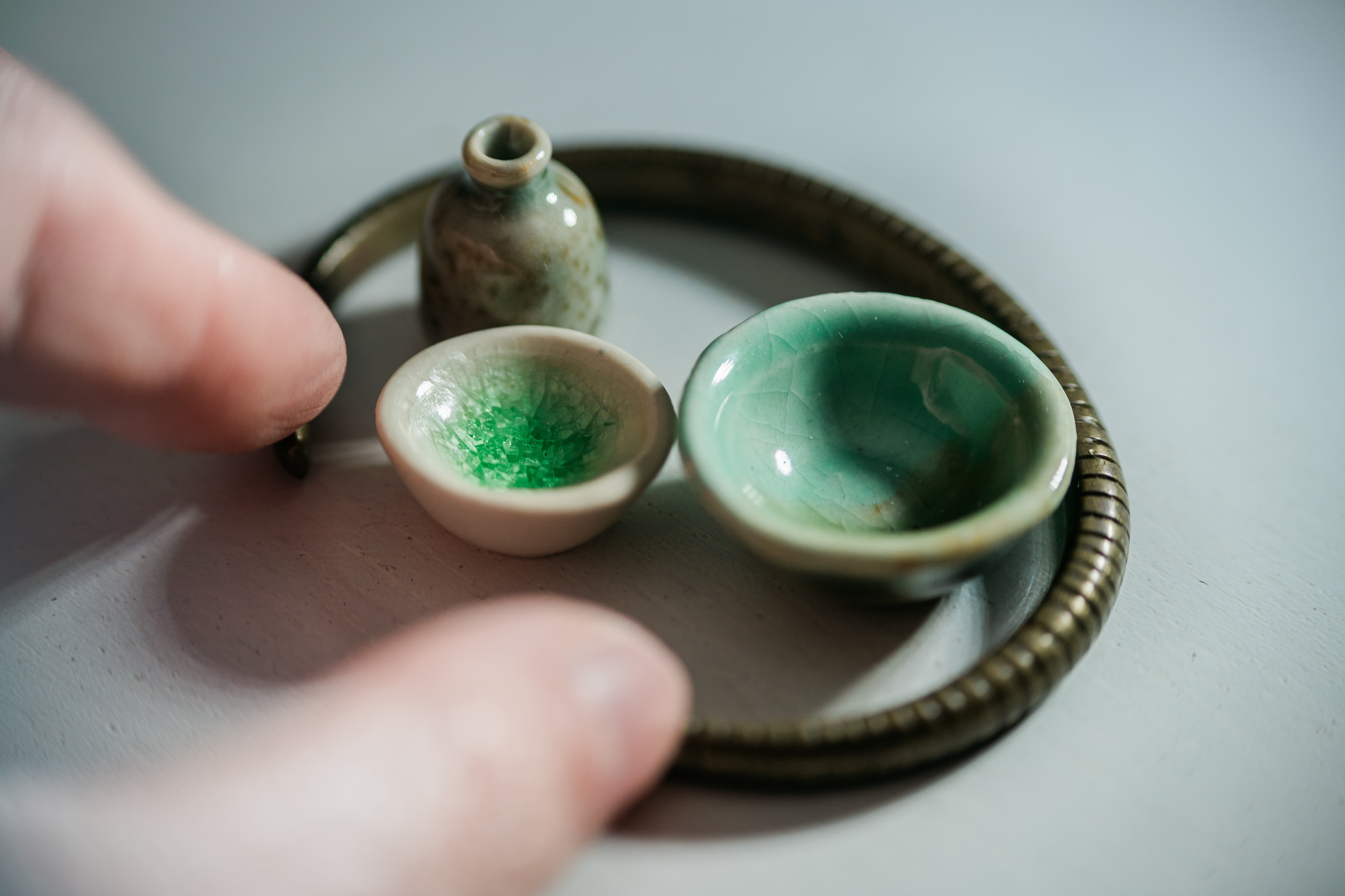
Miniture Tea Set
Oooooh. So tiny. So cute. This miniture tea set will put a smile on your face.
Responsive columns
Take a moment to resize the browser window. Adjust the width, both wider and narrower. Notice that the products appear squished when the browser window is narrow and stretched when the browser window is wide. This is because the Grid is not responsive. Let's fix that.
To make the Grid responsive, we will adjust the columns property. Set the columns property
to "medium".
<Grid columns="medium">...</Grid>
Now the Grid will fit as many columns as will fit in the available space, with each column being a minimum width of the t-shirt size 'medium'.
Did you know that Grommet uses "t-shirt sizes" to make implementing consistent layouts easy? Learn more about t-shirt sizing.
Notice how the number of columns changes as the browser window is resized. The Grid is now responsive.
Products
Handmade Wooden Chair
Sit and relax on a seat made from a real tree. Crafted by hand, by a real live person. This chair is made from a tree that was cut down and then carved.
Gorgeous Fluffy Towels
These towels are so fluffy, you'll want to take a nap on them. They're so fluffy, I'm gonna die!
Electronic Lemon Car
It's electronic. It's lemon in color. It's a car. What more do you need to know? It's almost as if two adjectives and a noun were chosen at random to describe this product.
Luxurious Soft Pizza
Luxurious melty cheese. Soft, chewy crust. Freshly baked. Mmmm... pizza.
Handcrafted Feather Hat
This entire hat is made from real feathers. Yankee-Doodle would be jealous.
Exotic Rubber Fish
This rubber fish is guaranteed to float and guaranteed to make your aquarium look more exotic.
Miniture Tea Set
Oooooh. So tiny. So cute. This miniture tea set will put a smile on your face.
Polishing the layout
Now that we have a responsive Grid, let's polish the layout. Let's add some space
between the products by adding gap="small" to the Grid.
<Grid columns="medium" gap="small">
  ...
</Grid>
Products
Handmade Wooden Chair
Sit and relax on a seat made from a real tree. Crafted by hand, by a real live person. This chair is made from a tree that was cut down and then carved.
Gorgeous Fluffy Towels
These towels are so fluffy, you'll want to take a nap on them. They're so fluffy, I'm gonna die!
Electronic Lemon Car
It's electronic. It's lemon in color. It's a car. What more do you need to know? It's almost as if two adjectives and a noun were chosen at random to describe this product.
Luxurious Soft Pizza
Luxurious melty cheese. Soft, chewy crust. Freshly baked. Mmmm... pizza.
Handcrafted Feather Hat
This entire hat is made from real feathers. Yankee-Doodle would be jealous.
Exotic Rubber Fish
This rubber fish is guaranteed to float and guaranteed to make your aquarium look more exotic.
Miniture Tea Set
Oooooh. So tiny. So cute. This miniture tea set will put a smile on your face.
Finally, let's refine the column width to be a bit more efficient with our screen's
real-estate. A minimum column width of "medium" feels too wide. Let's try setting
the columns property to "small".
<Grid columns="small" gap="small">
  ...
</Grid>
Now we are able to display more products in each row, but they become too narrow.
Let's make our final modifications by importing the function midSize from a
utilities file, add two additional lines of code which calculate a column width between
'small' and 'medium', and then use that value in the columns property.
...
import productList from './product-list.json';
import { midSize } from './utils';

const ProductsPage = () => {
  const themeContext = React.useContext(ThemeContext);
  const minColumnWidth = midSize('small', 'medium', themeContext);
  ...
  <Grid columns={minColumnWidth} gap="small">
    ...
  </Grid>
Congratulations! You have completed the tutorial and have a great start on a very respectable product catalog.
Products
Handmade Wooden Chair
Sit and relax on a seat made from a real tree. Crafted by hand, by a real live person. This chair is made from a tree that was cut down and then carved.
Gorgeous Fluffy Towels
These towels are so fluffy, you'll want to take a nap on them. They're so fluffy, I'm gonna die!
Electronic Lemon Car
It's electronic. It's lemon in color. It's a car. What more do you need to know? It's almost as if two adjectives and a noun were chosen at random to describe this product.
Luxurious Soft Pizza
Luxurious melty cheese. Soft, chewy crust. Freshly baked. Mmmm... pizza.
Handcrafted Feather Hat
This entire hat is made from real feathers. Yankee-Doodle would be jealous.
Exotic Rubber Fish
This rubber fish is guaranteed to float and guaranteed to make your aquarium look more exotic.
Miniture Tea Set
Oooooh. So tiny. So cute. This miniture tea set will put a smile on your face.
Summary
In this tutorial, you learned how to:
- Use the Grid component to present a collection of items in a grid.
- Use the
columnsproperty to specify the number and/or width of the columns. - Use the
columns.countproperty to specify the number of columns. - Use the
colums.sizeproperty to specify the width of the columns. - Use the
columnsproperty to respond to the space available. - Use the
gapproperty to add space between the items.
If you'd like to reference a completed implementation, check out this CodeSandbox with completed code.
Still have questions?
Something missing or looking for more information? Get in touch to help make the HPE Design System better.