In this tutorial you will use Box to build a hero section for a page and understand how to use some of its properties to:
- Orient the direction of your layout.
- Control the width of its content.
- Add a background color.
- Affect the amount of spacing between each of its child elements.
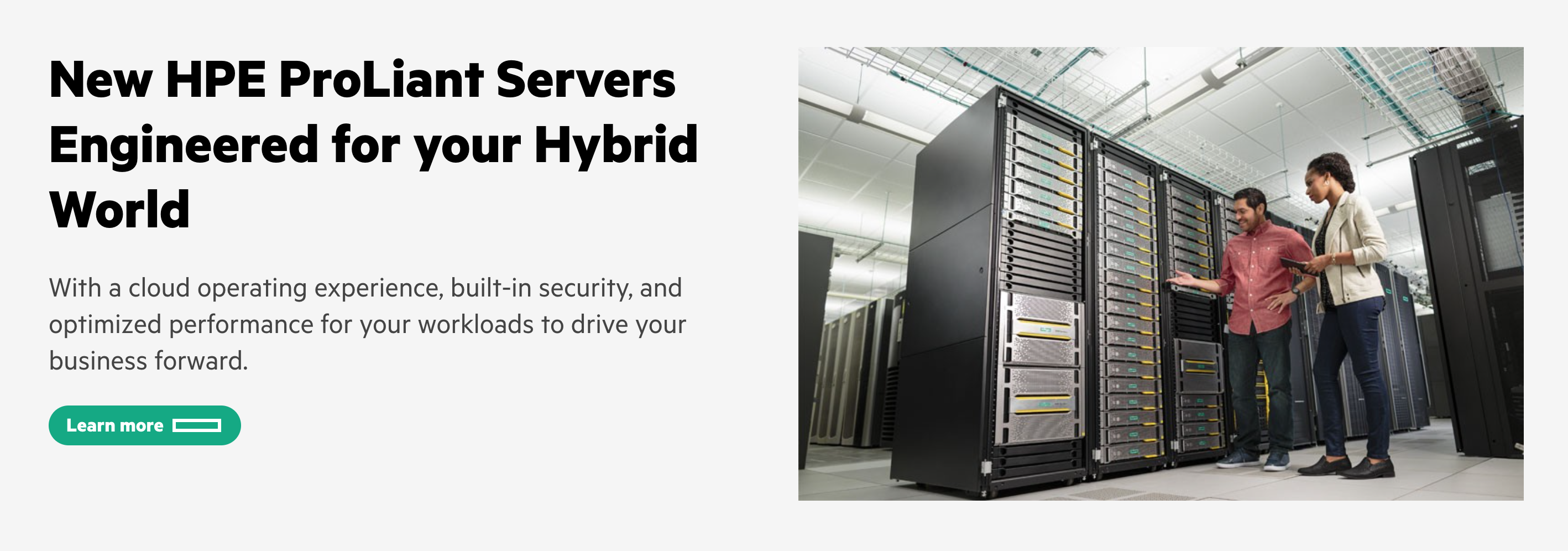
At the end of this tutorial, you will have built this:
Prerequisites
This tutorial can be completed in its entirety by following the steps below. However, because Grommet is a ReactJS-based UI library, introductory knowledge of React may be helpful in understanding the syntax.
Getting started
Let’s get started. Use this CodeSandbox template as a starter.
First, in App.js add the Box to your project by importing it from Grommet and placing it around the “hello world” text.
import { Box, Grommet } from 'grommet';
import { hpe } from 'grommet-theme-hpe';
...
return (
    // full="min" causes Grommet to fill the entire viewport
    <Grommet theme={hpe} full="min">
        <Box>Hello world</Box>
    </Grommet>
)
Add hero section content
Now, you'll add the content within the Box. Start by importing Button, Heading, Image, and Text.
import { Box, Button, Heading, Image, Paragraph } from 'grommet';
Replace “Hello world” with the following content as children of the Box.
...
<Box>
  <Heading margin="none">
    New HPE ProLiant Servers Engineered for your Hybrid World
  </Heading>
  <Paragraph size="xlarge" margin="none">
    With a cloud operating experience, built-in security, and optimized
    performance for your workloads to drive your business forward.
  </Paragraph>
  <Button label="Learn more" kind="cta-primary" />
  <Image
    alt="Two IT professionals inspecting a server rack."
    src="https://www.insight.com/content/insight-web/en_US/shop/partner/hewlett-packard-enterprise/product-portfolio/servers/jcr%3Acontent/top-inner-full-width/column_layout/-column-1/image_0.img.jpg/1566699651505.jpg"
  />
</Box>
...
At this point, your project should look like this:
Use direction to affect content layout
Now, we’d like to adjust the layout direction of the content so that the text appears on the left and the image on the right.
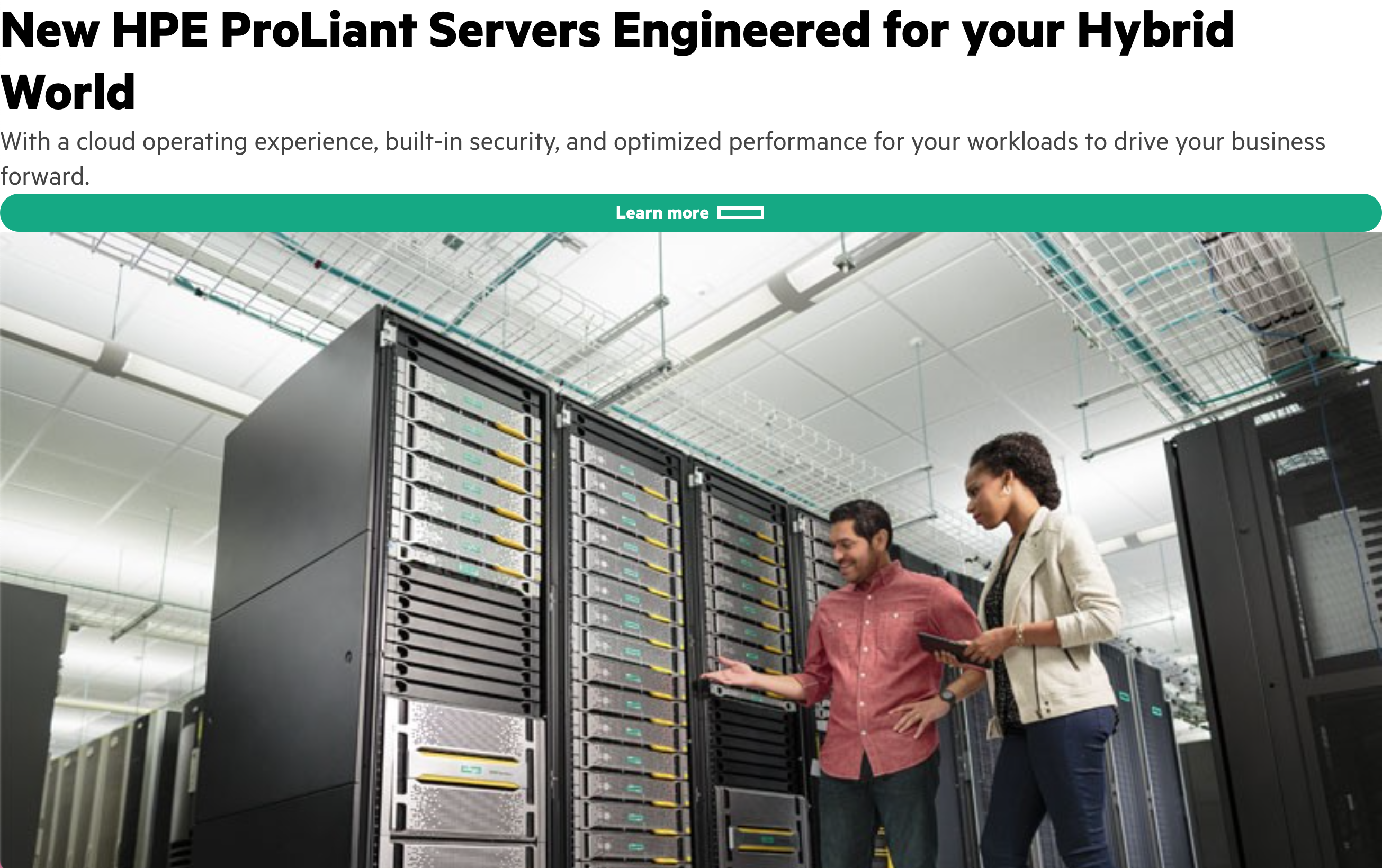
Box has a direction which specifies whether the Box's children are displayed vertically or horizontally. By default, the layout direction of Box is “column” which renders its children vertically. To adjust the direction, add direction="row" to the Box.
...
<Box direction="row">
  <Heading margin="none">
...
Notice how the content is displayed in a row from left to right. That is because each element was a direct child of the Box to which we added the direction property. However, we would like the heading, paragraph, and button to be grouped and displayed in a column. To do so, wrap these elements in a Box of their own.
<Box direction="row">
  <Box>
    <Heading margin="none">
      New HPE ProLiant Servers Engineered for your Hybrid World
    </Heading>
    <Paragraph size="xlarge" margin="none">
      With a cloud operating experience, built-in security, and optimized
      performance for your workloads to drive your business forward.
    </Paragraph>
    <Button label="Learn more" kind="cta-primary" />
  </Box>
  <Image
    alt="Two IT professionals inspecting a server rack."
    src="https://www.insight.com/content/insight-web/en_US/shop/partner/hewlett-packard-enterprise/product-portfolio/servers/jcr%3Acontent/top-inner-full-width/column_layout/-column-1/image_0.img.jpg/1566699651505.jpg"
  />
</Box>
Now, the image and the Box containing the heading, paragraph, and button are the only direct children of the container Box, so only those two elements are displayed in a row. For any content we wanted displayed in a column, we had to group it in its own Box.
At this point, your project should look like this:
Use Box to manage an image's width
Right now, the dimensions of the image file are determining how wide it is. In order to have more control of the image’s width, wrap the image in its own Box.
...
<Box>
  <Image
    alt="Two IT professionals inspecting a server rack."
    src="https://www.insight.com/content/insight-web/en_US/shop/partner/hewlett-packard-enterprise/product-portfolio/servers/jcr%3Acontent/top-inner-full-width/column_layout/-column-1/image_0.img.jpg/1566699651505.jpg"
  />
</Box>
...
Adjust width to manage content dimensions
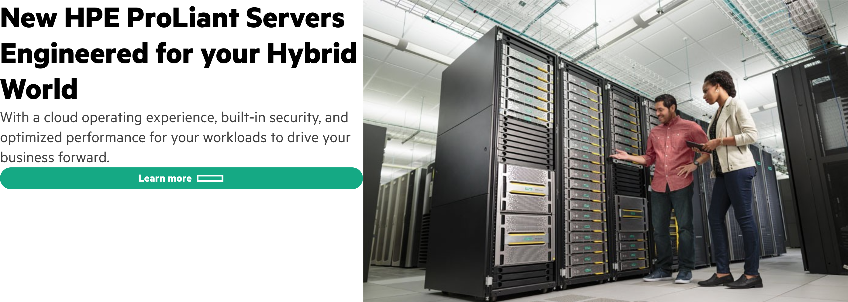
In order to ensure the text content remains a more readable width across wide screens, apply width="large" on the Box containing the heading, paragraph, and button.
To keep the button from stretching the full width of the box, apply alignSelf="start" on the Button. Notice how the button is no longer spanning the entire width of the Box.
<Box direction="row">
  <Box width="large">
    <Heading margin="none">
      New HPE ProLiant Servers Engineered for your Hybrid World
    </Heading>
    <Paragraph size="xlarge" margin="none">
      With a cloud operating experience, built-in security, and optimized
      performance for your workloads to drive your business forward.
    </Paragraph>
    <Button alignSelf="start" label="Learn more" kind="cta-primary" />
  </Box>
  <Box>
    <Image
      alt="Two IT professionals inspecting a server rack."
      src="https://www.insight.com/content/insight-web/en_US/shop/partner/hewlett-packard-enterprise/product-portfolio/servers/jcr%3Acontent/top-inner-full-width/column_layout/-column-1/image_0.img.jpg/1566699651505.jpg"
    />
  </Box>
</Box>
At this point, your project should look like this:

Add a background color and pad
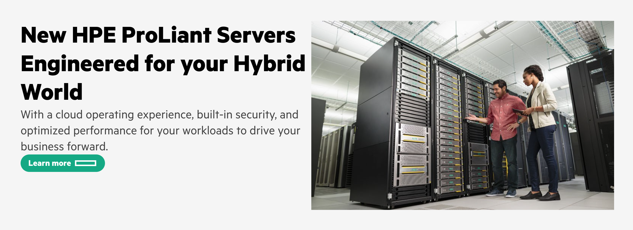
Now, let’s add a background color to the hero section by adding background="background-contrast" to the outer Box. We also want some space added between the edge of the outer Box and the content. To do so, add pad="large" to the outer Box.
Remember that pad (equivalent to CSS padding) applies space inside of a given container while margin applies space outside of a given container.
<Box direction="row" background="background-contrast" pad="large">
  <Box width="large">
    <Heading margin="none">
      New HPE ProLiant Servers Engineered for your Hybrid World
    </Heading>
    <Paragraph size="xlarge" margin="none">
      With a cloud operating experience, built-in security, and optimized
      performance for your workloads to drive your business forward.
    </Paragraph>
    <Button alignSelf="start" label="Learn more" kind="cta-primary" />
  </Box>
  <Box>
    <Image
      alt="Two IT professionals inspecting a server rack."
      src="https://www.insight.com/content/insight-web/en_US/shop/partner/hewlett-packard-enterprise/product-portfolio/servers/jcr%3Acontent/top-inner-full-width/column_layout/-column-1/image_0.img.jpg/1566699651505.jpg"
    />
  </Box>
</Box>
At this point, your project should look like this. We’re getting closer, but we’re missing spacing between the various content elements, such as the space between heading and paragraph, paragraph and CTA button, and text and image.
Use gap to add space between elements
Now, let’s add the spacing between elements. Whenever space is needed between elements, use gap on the parent Box of those elements. To add space between the image and the grouped content, add gap="large" to the outer Box.
<Box direction="row" background="background-contrast" pad="large" gap="large">
  <Box width="large">
    <Heading margin="none">
      New HPE ProLiant Servers Engineered for your Hybrid World
    </Heading>
    <Paragraph size="xlarge" margin="none">
      With a cloud operating experience, built-in security, and optimized
      performance for your workloads to drive your business forward.
    </Paragraph>
    <Button alignSelf="start" label="Learn more" kind="cta-primary" />
  </Box>
  <Box>
    <Image
      alt="Two IT professionals inspecting a server rack."
      src="https://www.insight.com/content/insight-web/en_US/shop/partner/hewlett-packard-enterprise/product-portfolio/servers/jcr%3Acontent/top-inner-full-width/column_layout/-column-1/image_0.img.jpg/1566699651505.jpg"
    />
  </Box>
</Box>
Notice how the gap only applies between the image and the heading/paragraph/button group but not between the heading, paragraph, and button. That’s because gap will only apply space between the direct children of a Box. In this case, the direct children were:
- The Box containing the Heading, Paragraph, and Button.
- The Box containing the Image.
Now, add space between the heading, paragraph, and button by applying gap="medium" to the Box that wraps those elements.
...
<Box width="large" gap="medium">
    <Heading margin="none">
        New HPE ProLiant Servers Engineered for your Hybrid World
    </Heading>
    <Paragraph size="xlarge" margin="none">
        With a cloud operating experience, built-in security, and optimized
        performance for your workloads to drive your business forward.
    </Paragraph>
    <Button alignSelf="start" label="Learn more" kind="cta-primary" />
</Box>
...
Great job! You have built a hero section of a page using Box and its various properties. Your project should look like this:
If you'd like to reference a completed implementation, check out this CodeSandbox with completed code.
Related
Related content you may find useful when using The Box Model Part One.
Box
Button

Typography
Still have questions?
Something missing or looking for more information? Get in touch to help make the HPE Design System better.